

10 Best Flipbook Software Tools: Player Design Compared
The moment you embed a catalog, the player's design becomes part of your website. Its background frames your photography. Its buttons guide your readers. WebViewPDF brings a clean, modern interface to that experience, with compact floating controls, clear zoom and simple navigation. Here is how its player compares with nine popular alternatives, illustrated with real screenshots and demos.
Disclosure: We make WebViewPDF and put it first because a clean, modern player is the focus of this comparison. Screenshots show public demos captured on October 30, 2026. The design judgments are our own; themes and controls can be customized.
What makes a flipbook player feel modern?
A furniture lookbook may have carefully chosen type, generous margins and beautiful photography. The player becomes part of that presentation as soon as you put it on your website. Its background, buttons and navigation deserve the same attention as the PDF.
We look for five things:
- A quiet frame. A restrained background lets the publication set the visual tone.
- Clear controls. Recognizable icons, consistent button shapes and enough spacing make the next action easier to spot.
- Useful zoom. Readers should be able to find the zoom control, inspect a detail and return to the page view.
- Simple navigation. Turning a page, checking your position and finding a section should each have an obvious route.
- A good fit on your website. The player should sit comfortably alongside your typography, product images and calls to action.
These are the qualities behind our preference for WebViewPDF. Start with its player, then compare the alternatives below.
1. WebViewPDF — a clean, modern player for your website
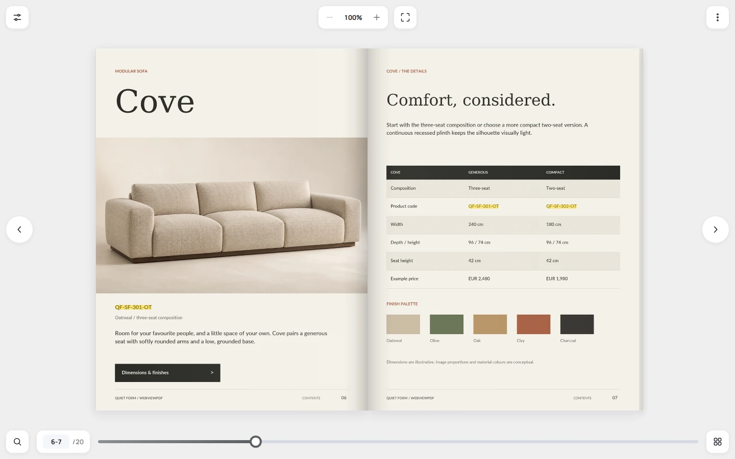
The Quiet Form catalog below shows what we want a flipbook to feel like: a large, inviting spread with a light interface around it. White controls float on a soft gray background. The same rounded shapes and fine icons carry through settings, zoom, search and page navigation. The catalog supplies the color and personality.
Three details make this design work for us:
- Controls have clear places. Zoom and fullscreen sit together above the spread. Page position and the progress slider sit below it. Large circular arrows make the next page easy to spot.
- The interface stays visually light. Small groups of buttons leave open space around the catalog. A neutral background and subtle shadows frame the pages without adding another decorative theme.
- The reader can browse or go straight to a detail. Use the page arrows to explore, open thumbnails to jump through the catalog, or search for a product code and follow a highlighted result. The zoom control displays the current percentage.
That combination is WebViewPDF's advantage: a restrained visual style with practical reading tools close at hand. Compared with the continuous toolbars and decorative backgrounds in several demos below, its separate floating controls give the publication a calmer setting. It is an especially good fit for catalogs, brochures and lookbooks where the design of the reading experience matters.
You can change the background and accent color, choose which controls appear and add your own logo. On touch devices, swipe navigation and pinch zoom support reading on a smaller screen. Search works with the text in your PDF; scanned pages need a text layer prepared before upload.
Try the player: open the Quiet Form demo, turn a few pages, zoom into the sofa specifications and search for qf-sf. Then see how the same interface frames your own PDF.
Explore WebViewPDF's features and current plans for customization and publishing options.
The player styles at a glance
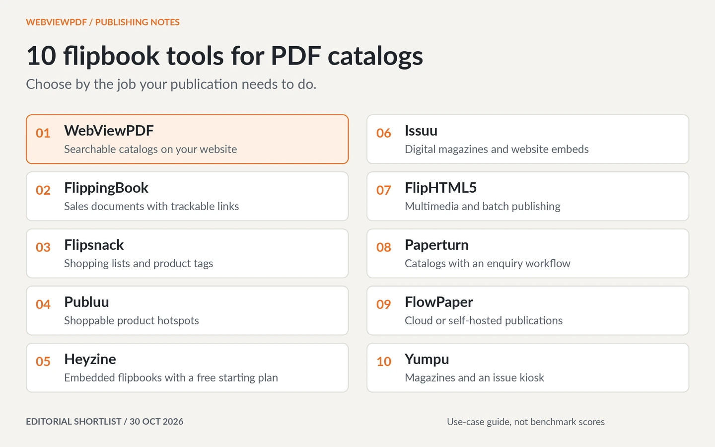
The ten services cover a range of publishing needs, from individual brochures to magazine libraries. This comparison focuses on the interface around the document. Use the table to find a player style, then inspect its screenshot and open the linked demo. On a phone, swipe the table sideways.
| Service | Visible in the demo | Design consideration |
|---|---|---|
| 1. WebViewPDF | Neutral canvas, floating button groups, separate zoom and page navigation | Our pick for a restrained player on a modern website |
| 2. FlippingBook | Large spread, slim title row, textured backdrop | A familiar digital-brochure presentation with a more decorative frame |
| 3. Flipsnack | Dark canvas and a continuous bottom toolbar | Strong contrast and controls concentrated along one edge |
| 4. Publuu | Blue patterned background, thin arrows and a bottom slider | The surrounding theme is a visible part of the presentation |
| 5. Heyzine | Colorful round icons and a photographic backdrop | An expressive frame with more color outside the document |
| 6. Issuu | Dark canvas and prominent side arrows | A quiet reading view; the crop does not show the full controls |
| 7. FlipHTML5 | Left tool strip, top page controls and a vivid background | Tools occupy multiple edges of the reading area |
| 8. Paperturn | Labeled top toolbar and a separate bottom navigation bar | Explicit tool labels in a more substantial frame |
| 9. FlowPaper | Large spread, side arrows and a textured background | A print-like setting; the toolbar is outside this crop |
| 10. Yumpu | Dark teal canvas and a long bottom control row | A magazine-reader layout with small controls across its width |
2. FlippingBook — a familiar digital-brochure presentation
The Havwoods demo gives most of the window to the catalog. A slim row at the top carries the title, page position and search icon, while arrows sit beside the spread. It is an immediately recognizable digital-book layout.
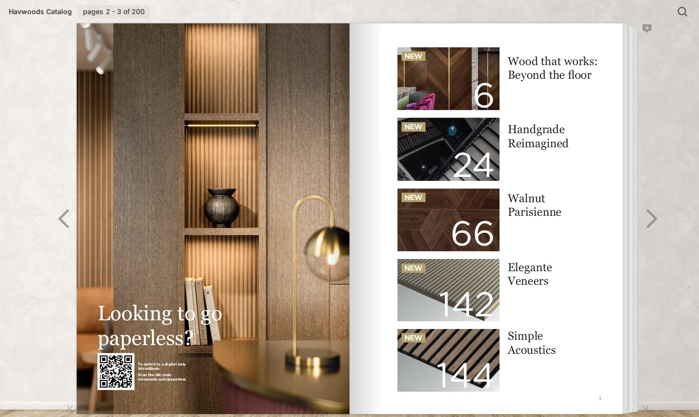
The textured background and visible page stack extend the printed-book metaphor beyond the pages themselves. That treatment suits the material samples in this catalog. WebViewPDF takes a more contemporary web-app approach: a plain canvas and clearly defined button surfaces separate the controls from the document. Open the demo to compare the controls in use, since this crop excludes the bottom edge.
3. Flipsnack — a dark canvas with a full-width toolbar
The Harbour Shores demo sets a property brochure against a dark gray background. Large side arrows frame the spread. A black toolbar along the bottom groups page position, zoom, thumbnails, sharing and fullscreen, with a progress track just above it.

This arrangement keeps the tools together and gives the photography strong contrast. The continuous dark bar also forms a more prominent border beneath the publication. WebViewPDF's floating groups offer a lighter frame if you want the catalog to sit within a bright, spacious website.
4. Publuu — a themed stage around the publication
Publuu's example uses a blue patterned background, slim side arrows and a long page slider. A video hotspot sits directly on the right-hand page. The surrounding color gives the whole reader a strong identity before you interact with the document.
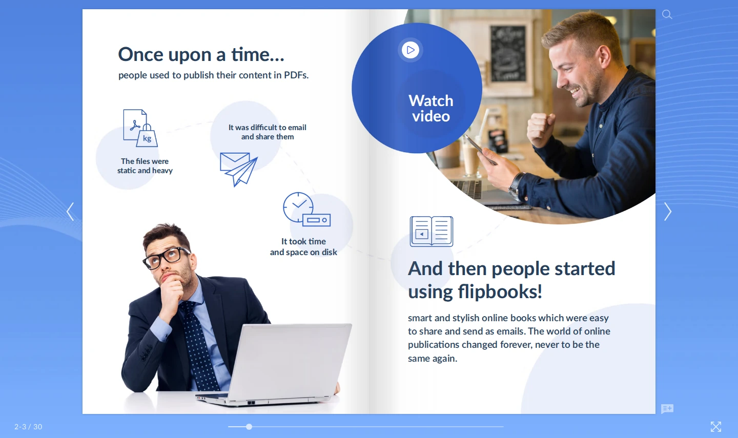
The blue theme matches this particular demo. With your own catalog, consider how its colors will sit beside the player's background. Also look at the thin, pale controls against that background. WebViewPDF's demo uses distinct white button surfaces to keep controls visually separate from the canvas.
5. Heyzine — colorful controls and an expressive backdrop
Heyzine's Venice guide has a row of small, colorful circular buttons above the spread. A faded city photograph surrounds the pages. Together, the icons and backdrop give it a playful travel-publication feel.
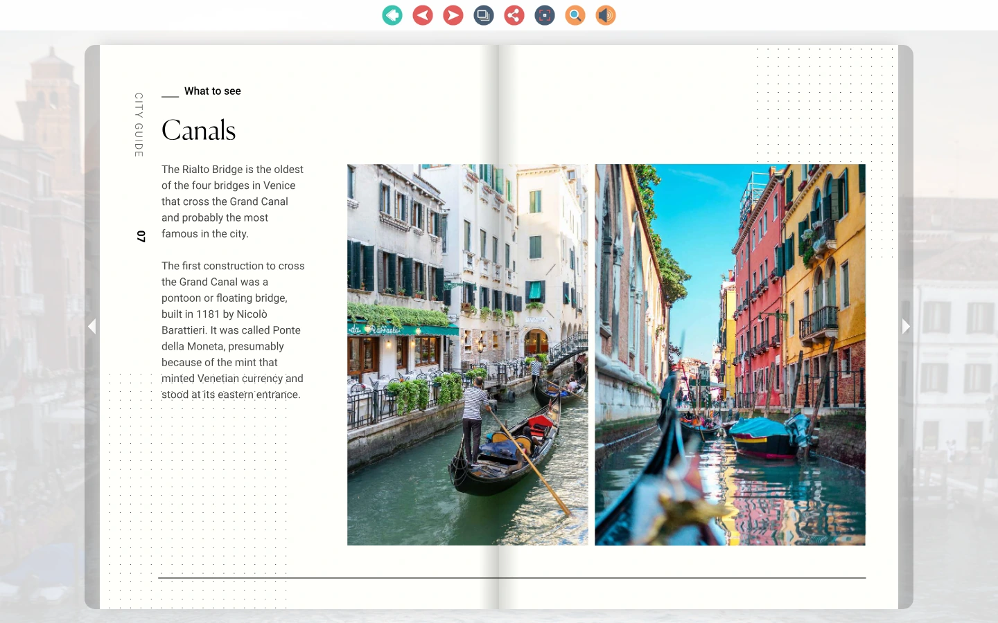
The frame adds color beyond the document's own palette. That can work for an informal guide; a restrained product catalog may benefit from a quieter treatment. WebViewPDF uses a consistent neutral treatment across its buttons, with space between the main groups. That gives the publication more control over the visual tone.
6. Issuu — a quiet view on a dark canvas
The York University report appears on a dark gray canvas with prominent white page arrows. In this captured view, very little surrounds the spread. It is a good reminder that a simple reading presentation is possible in several services.
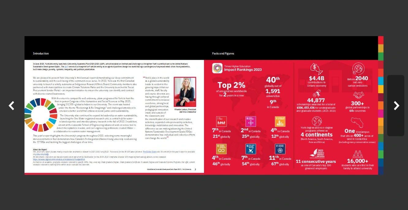
This crop shows the publication and page arrows, so use the live demo to assess the rest of the interface. Find zoom, inspect the smaller report text and return to the spread. Those steps help distinguish a clean screenshot from a reading experience that feels clear throughout. In WebViewPDF's desktop example, the zoom percentage and page position are already visible around the catalog.
7. FlipHTML5 — tools around multiple edges
The fashion-lookbook demo puts page navigation at the top and a vertical tool strip on the left. A colorful background fills the space around the book. The document is large, but the reader's attention has several places to go outside it.
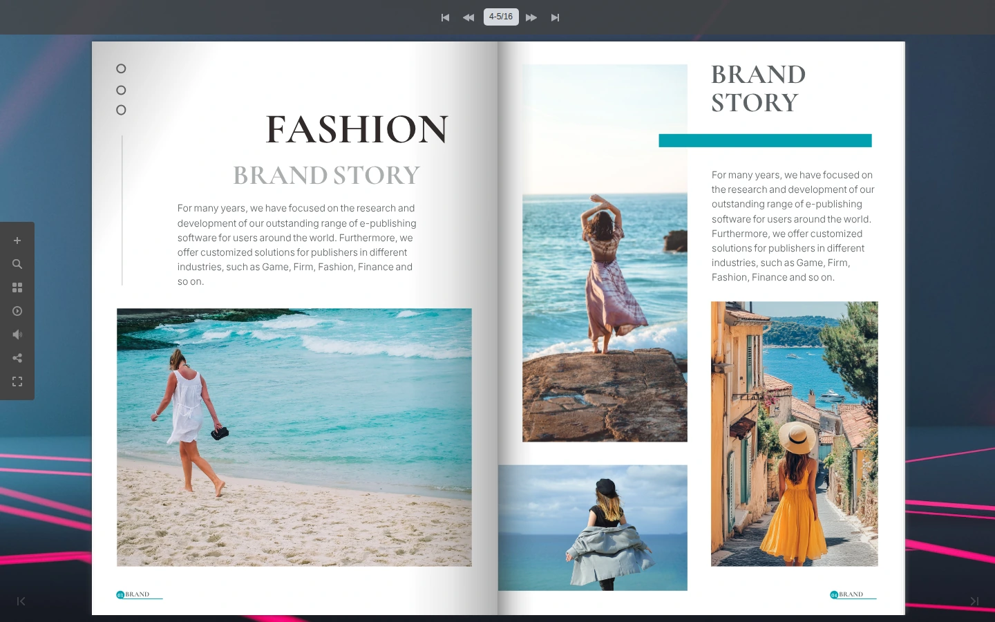
This configuration makes a broad set of tools visible at once. The decorative background and multiple navigation areas give the player more visual weight. WebViewPDF's quieter frame leaves the mood to the catalog's photography. Compare equivalent settings with your own PDF before deciding on a style.
8. Paperturn — explicit labels in a substantial frame
Paperturn's Micro Matic example places named tools across a red top bar: Contents, Search, Overview, Download as PDF, Print, Share and Accessibility. Page navigation occupies another bar below the document. The labels tell readers what the tools do without relying on icons alone.
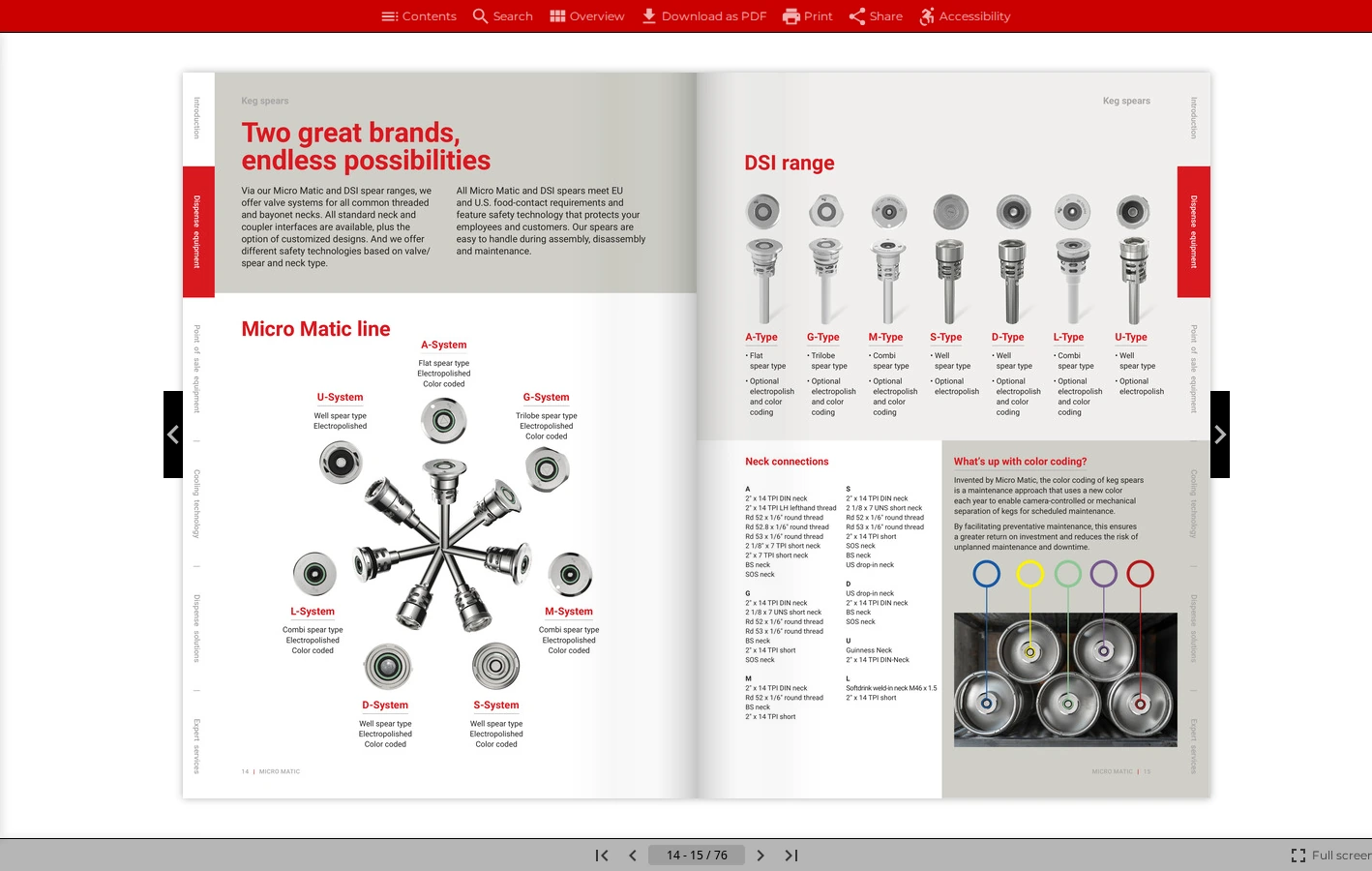
Those visible labels are useful, particularly when readers need a specific document tool. The tradeoff is a more substantial frame with two full-width bars. WebViewPDF takes a more compact approach through small groups of icons. Consider whether your publication benefits more from persistent labels or from open space around its pages.
9. FlowPaper — an immersive, print-like spread
FlowPaper's travel-brochure example presents a wide landscape spread on a textured background, with white page arrows at either side. The photography dominates the captured area, and the center shading reinforces the impression of an open printed brochure.
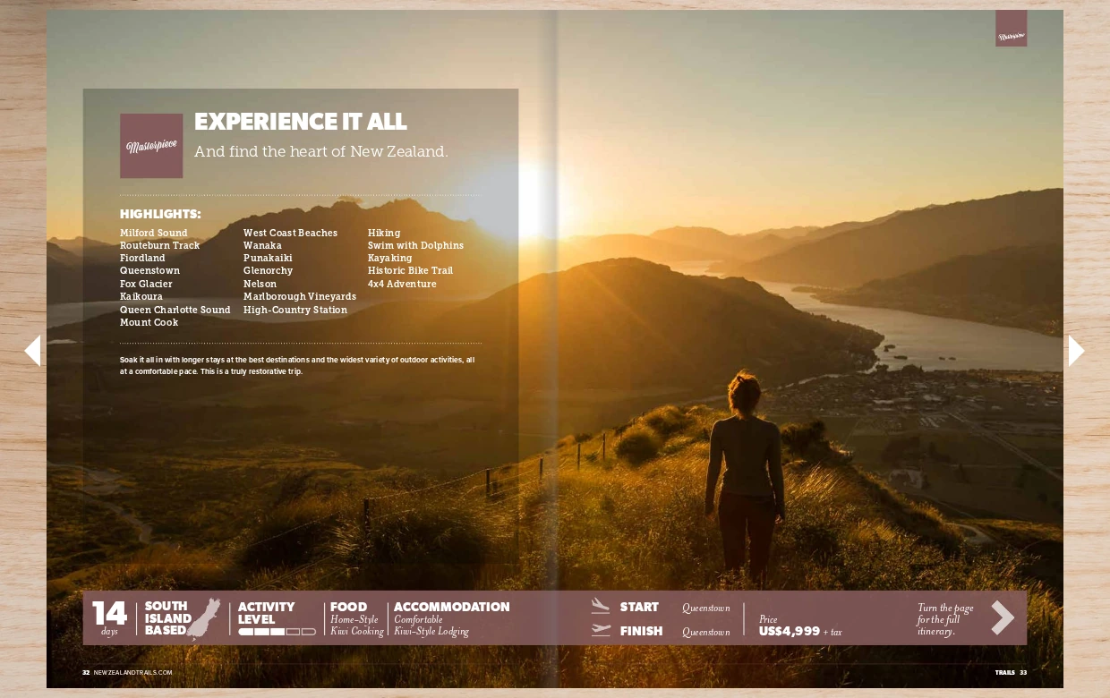
This image is cropped to the spread and arrows; the toolbar is outside the frame. Judge zoom and navigation in the live player. Visually, the textured setting continues the print metaphor. WebViewPDF's simpler background gives the same kind of visual publication a setting closer to the rest of a contemporary website.
10. Yumpu — a magazine reader with a long control row
The Sundowner magazine demo uses a dark teal canvas and large circular page arrows. A bottom row combines contents, thumbnails, progress, zoom, search and fullscreen. The pages occupy most of the captured view, with many small tools spread across its lower edge.
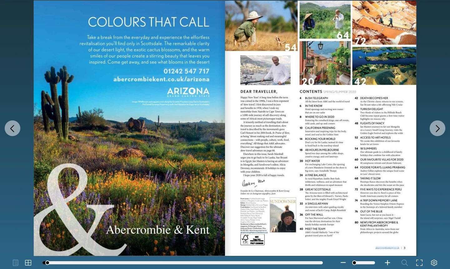
That layout will feel familiar to readers of online magazines. WebViewPDF gives the zoom control its own group above the spread and displays the percentage between the minus and plus buttons. Separating zoom from page navigation gives these two common tasks distinct places in the interface.
Try the reading experience with your own PDF
The strongest reason to choose WebViewPDF is the experience your visitors get: a polished frame, clear places for the main controls and several ways into the catalog. The screenshot shows the design; a short reading session lets you judge the interaction.
Open the WebViewPDF demo, then try the same tasks with your own publication:
- Browse a spread. Turn forward and back. Notice how the player frames your photography and typography.
- Inspect a detail. Find zoom, read a specification and return to the full page.
- Find a page. Use thumbnails or search to reach something deeper in the catalog.
- Open it on your phone. Swipe, zoom and follow a link. Check the embedded view on a draft website page too.
Choose the background and visible controls to suit your website. Check the current plans for the publishing and customization options you need, then give readers the catalog in a player you are happy to put beside the rest of your brand.
Turn your PDFs into interactive catalogs
WebViewPDF turns static PDF files into interactive flipbooks you can embed on any website. Perfect for catalogs, magazines, brochures and presentations — bring your documents to life in a couple of minutes.
Start your 14-day free trialFAQ
What is the best flipbook software for a modern player?
Our pick is WebViewPDF. Its neutral canvas, compact floating controls and consistent buttons give a finished PDF a calm setting on your website. The screenshots above show how that approach differs from dark toolbars, decorative themes and denser control layouts. Try your own document to judge the fit.
Does a cleaner player make the PDF itself look better?
The player frames your existing pages; their layout, typography and source-image quality still come from the PDF. A restrained interface gives those design choices room. Upload a well-prepared file and check both the full spread and small text at zoom.
Can other flipbook players have a minimal design?
Yes. Backgrounds, visible controls and themes can change the result, and the screenshots show individual configurations. We prefer WebViewPDF's combination of a light visual frame and easy-to-find reading controls. Compare your finalists with the same PDF and similar settings.
Can I match WebViewPDF to my website?
You can change the background and accent color, choose visible controls and add your own logo. Embed the player with a script or iframe, then check it alongside your website's content. The features page describes the options; pricing lists current plan conditions.
Read also
- Flipbook vs PDF: 6 Benefits for Your Online Catalog
- Searchable PDF Catalog: How to Let Buyers Find Any Product by Part Number
Sources and comparison scope
Each player screenshot links to its public demo. Captures date from October 30, 2026, with an original desktop viewport of 1440 × 900 pixels; captions identify cropped views. The documents, themes and visible controls differ. These examples support comments on the interfaces shown, rather than universal claims about every configuration. Cropped or hidden controls are not evidence that a feature is missing.
WebViewPDF's feature descriptions follow our documented player and the features page. Design preferences are our own. This comparison does not measure loading speed, accessibility compliance, conversion rates or usability with a test group.